Clubware App
Web & App Design
2022
Product Designer
Scope
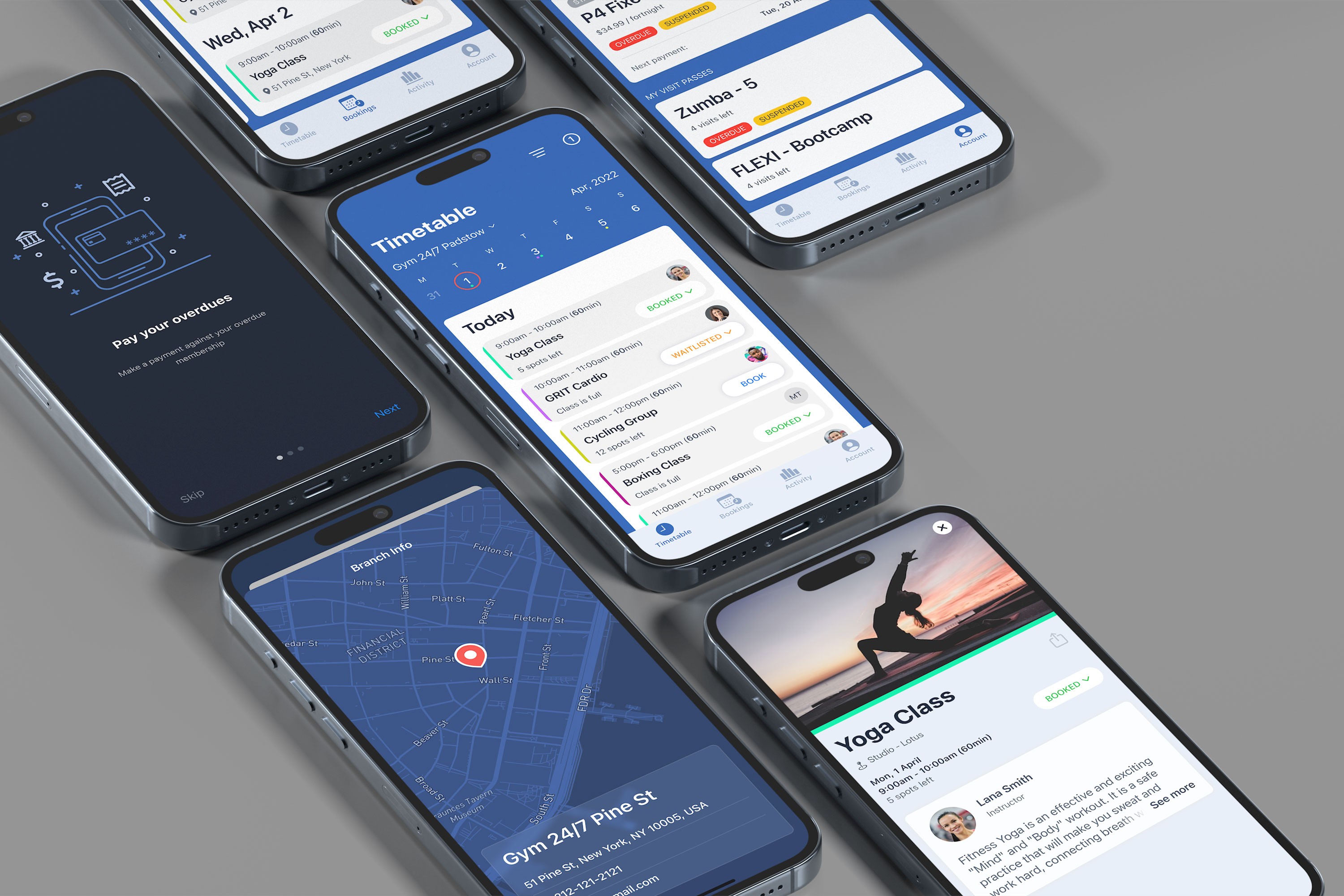
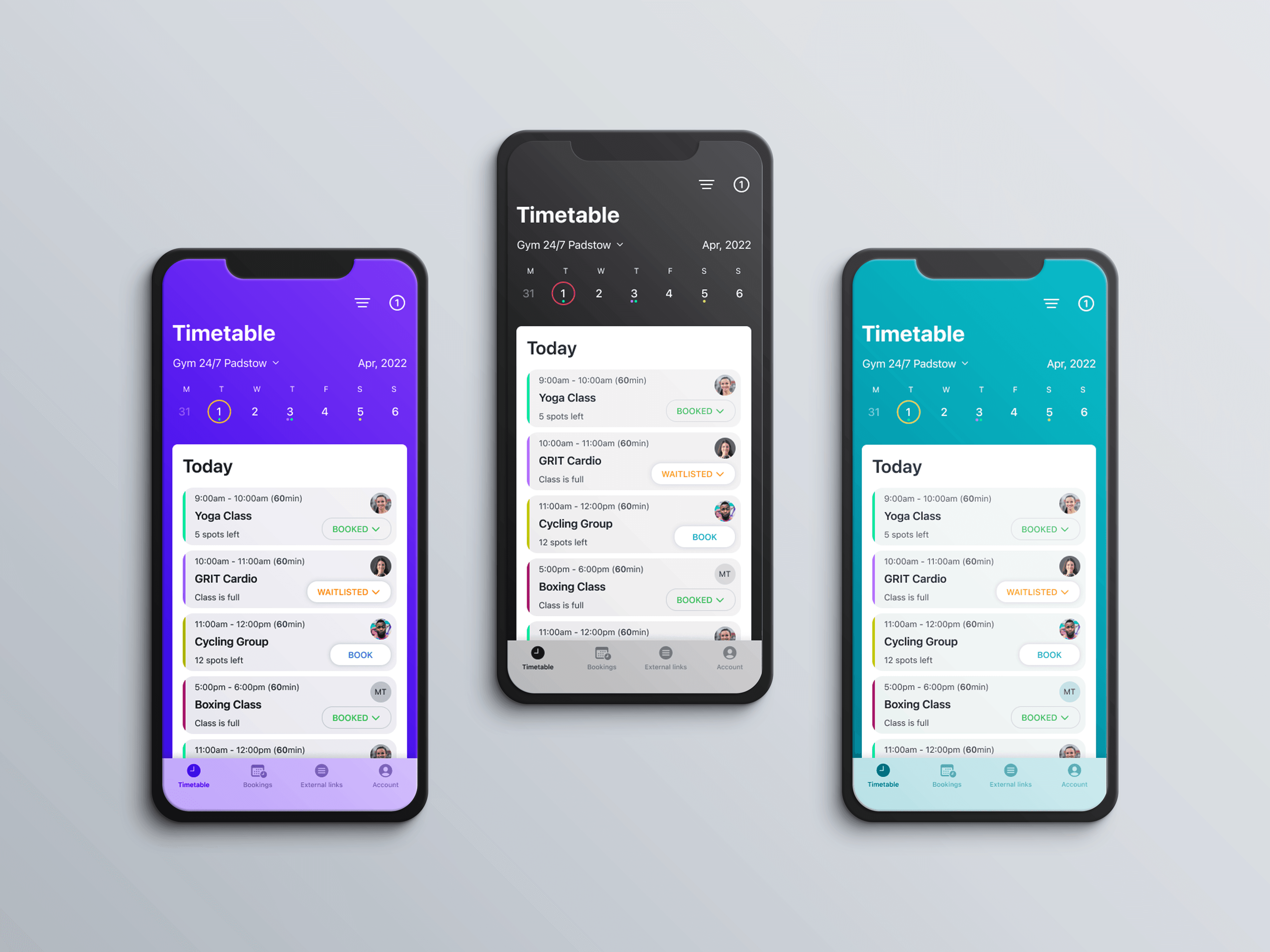
The Clubware app provides members with the flexibility to view timetables and book classes at any gym location based on their membership type. Designed for both iOS and Android, the app follows a white-label design system, allowing customization for different brands. Each component supports dynamic color adaptation, where a single primary color selection automatically generates the entire color scheme, ensuring visual consistency and ease of customization.
As a Product Designer, I specialized in crafting intuitive and user-centric digital experiences by combining UX research, UI design, and interaction design. My role involved conducting user research, creating wireframes and prototypes, and developing design systems to ensure consistency across products. I collaborated closely with developers, stakeholders, and product managers to translate business goals into seamless and engaging user interfaces.

Research
I researched, analyzed, and gathered insights to redesign an e-commerce platform. I ideated, sketched, and created high-fidelity designs for a modern look. User testing was conducted for feedback, and the site was built using Webflow for responsiveness and performance optimization.
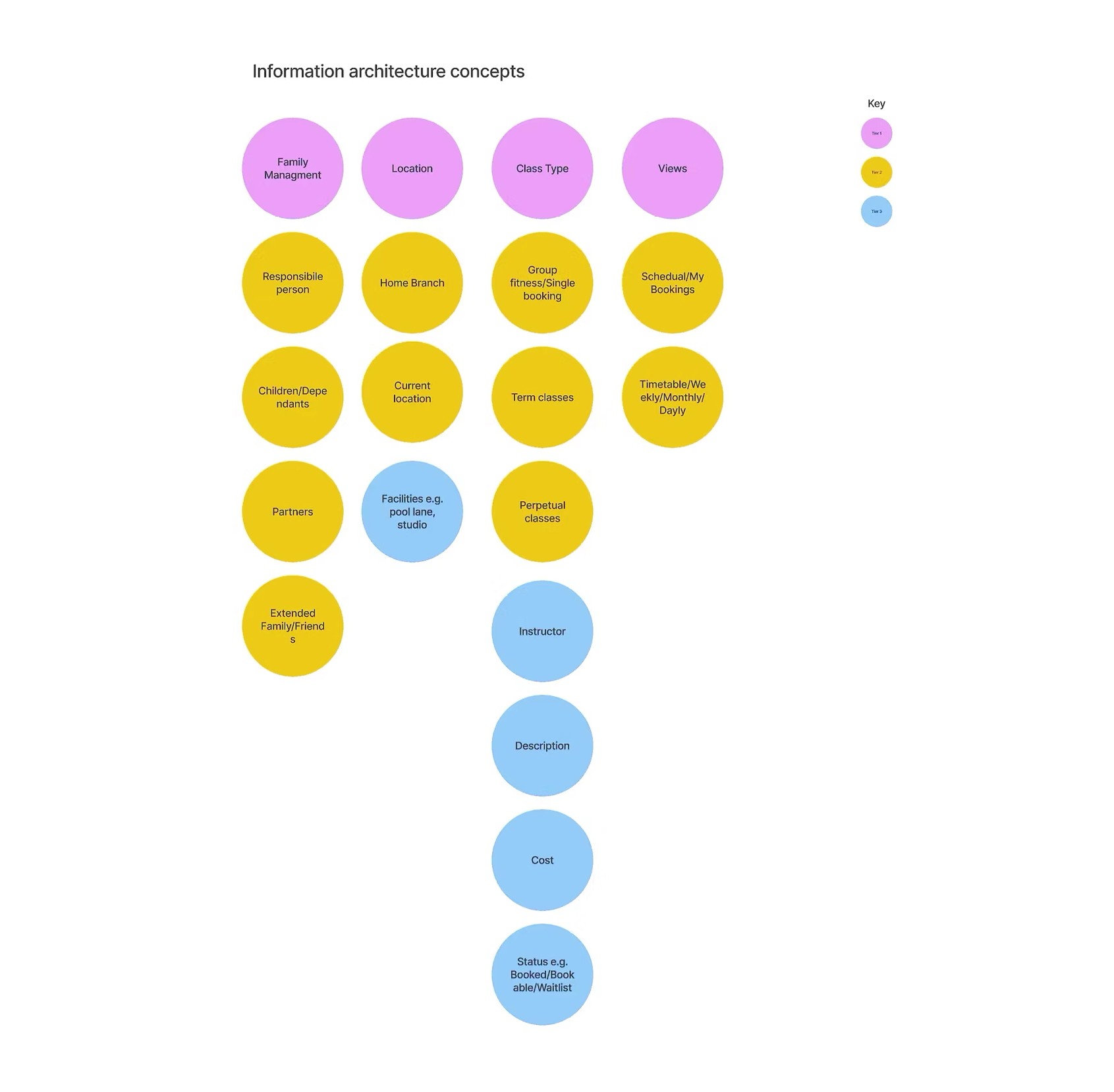
During user testing for our SaaS mobile app for gym members, we conducted interviews with 20 participants to understand their behaviors and challenges. To validate these insights on a larger scale, we surveyed 100 Australian gym-goers using Google Surveys. Additionally, we ran workshops to refine and align our personas, comparing findings and incorporating stakeholder feedback. The final personas reflect key gym functions, despite variations in job titles and responsibilities across organizations.

Prototyping & Testing
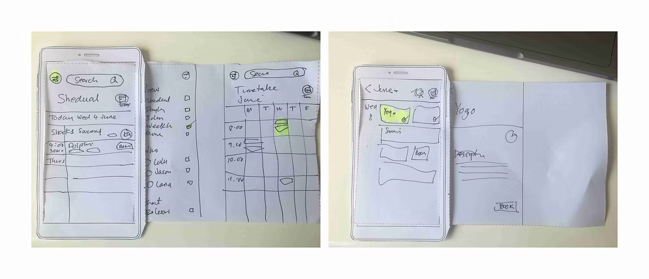
I collaborated with the UX Researcher on the design workshops with the cross-functional teams including the product manager, product marketer, and BA. I used a paper prototype to mock up the product quickly and tested the ideas as early as possible.
I found it harder for the users to understand the paper wireframes, so I used the blueprint prototype for usability testing, and I analyzed the details of the testing result and made the adjustment in the later hi-fi design.
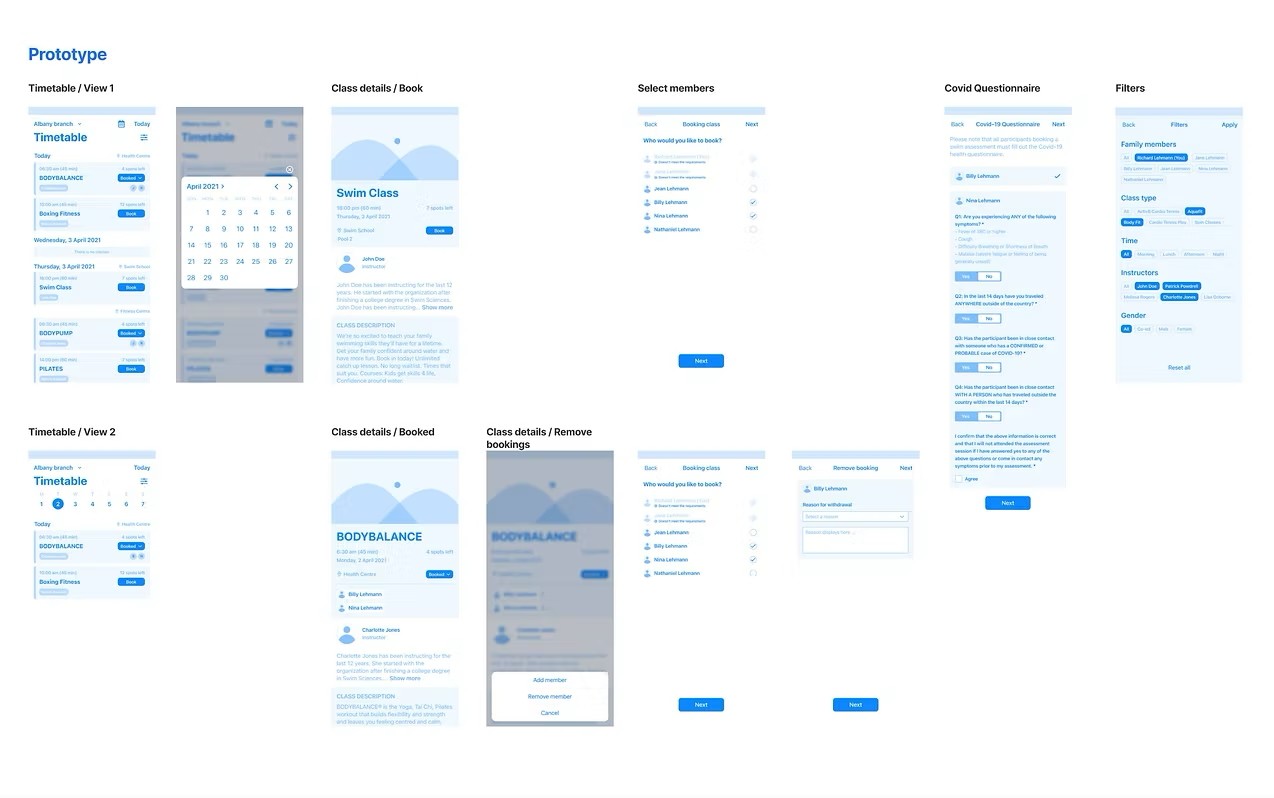
Design & Iterations
The white-label mobile app redesign successfully enhanced usability, ensured brand adaptability, and provided a seamless experience across iOS and Android platforms. By following iOS UI Kit and Material Design guidelines, the interface remained intuitive and consistent while meeting platform standards. Through user research, iterative testing, and collaboration with stakeholders, the final design streamlined navigation, improved accessibility, and delivered a polished, scalable solution for diverse users.

Next Project