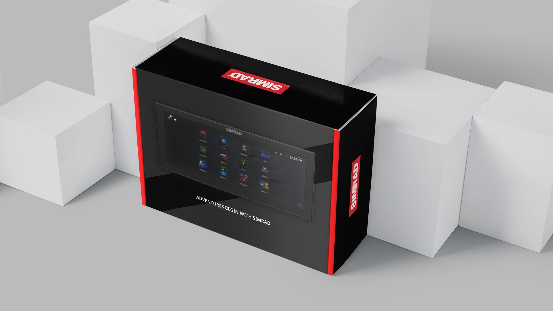
Simrad Branding
Web & App Design
2024
Product Designer
Scope
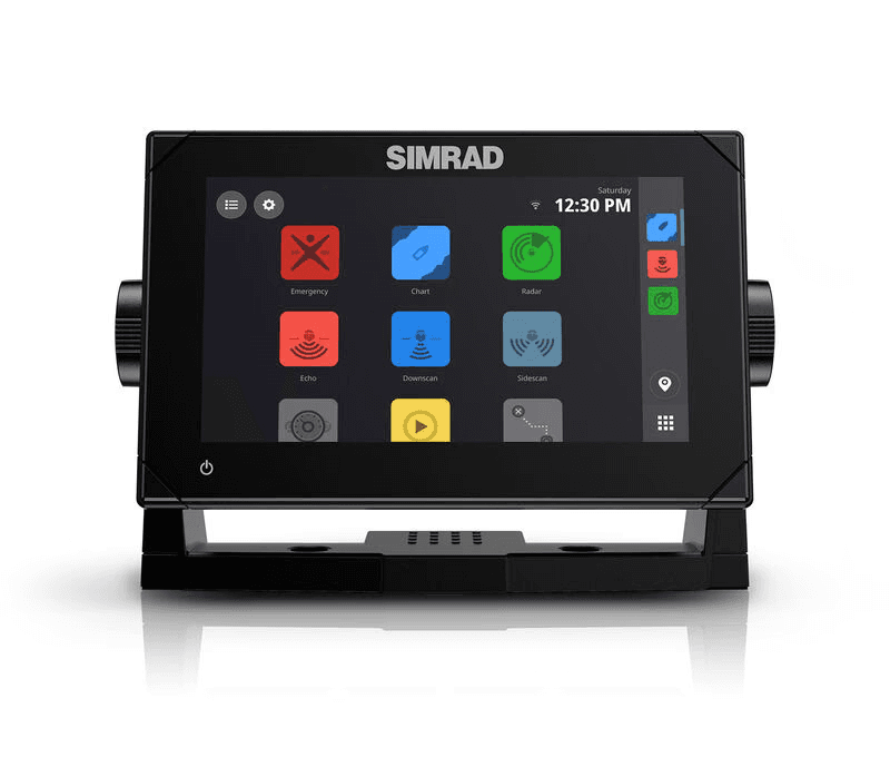
Simrad Yachting, a challenger brand in a highly competitive market, aimed to elevate its digital experience to better reflect its premium positioning. The existing UI (image below) relied on flat, cartoon-like icons with inconsistent styling, washed-out colors, and lacked visual depth-resulting in a static interface that didn’t align with the brand’s evolving identity. In a space where most competitors look and feel the same, Simrad needed a distinct and refined design language to stand out.
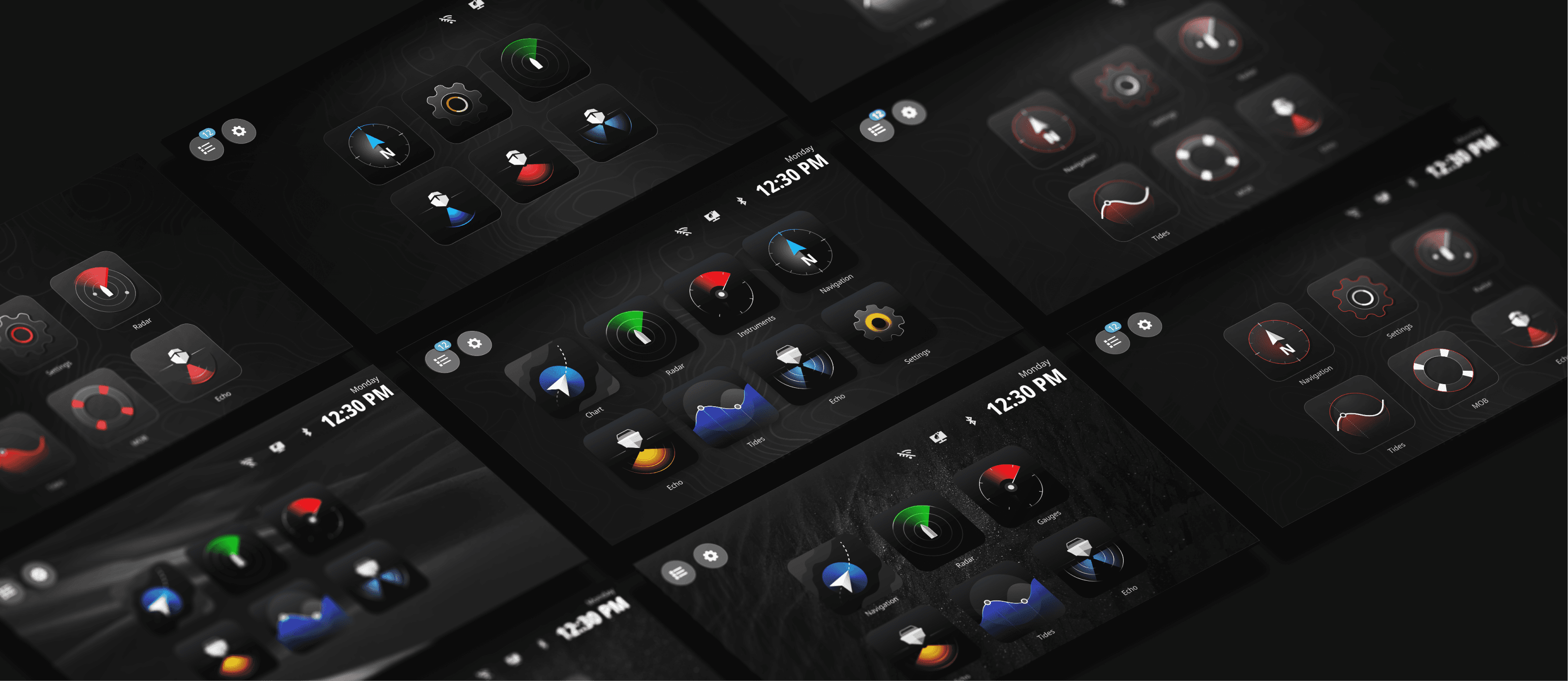
This project focused on redesigning the entire icon system to be intuitive, scalable, and visually consistent across platforms. While it began with a small brief, the scope quickly expanded, touching broader aspects of the interface. The goal was not just to modernize the visuals but to create a cohesive system that enhances usability and aligns with Simrad’s updated brand strategy across devices and screen resolutions.
Inspiration
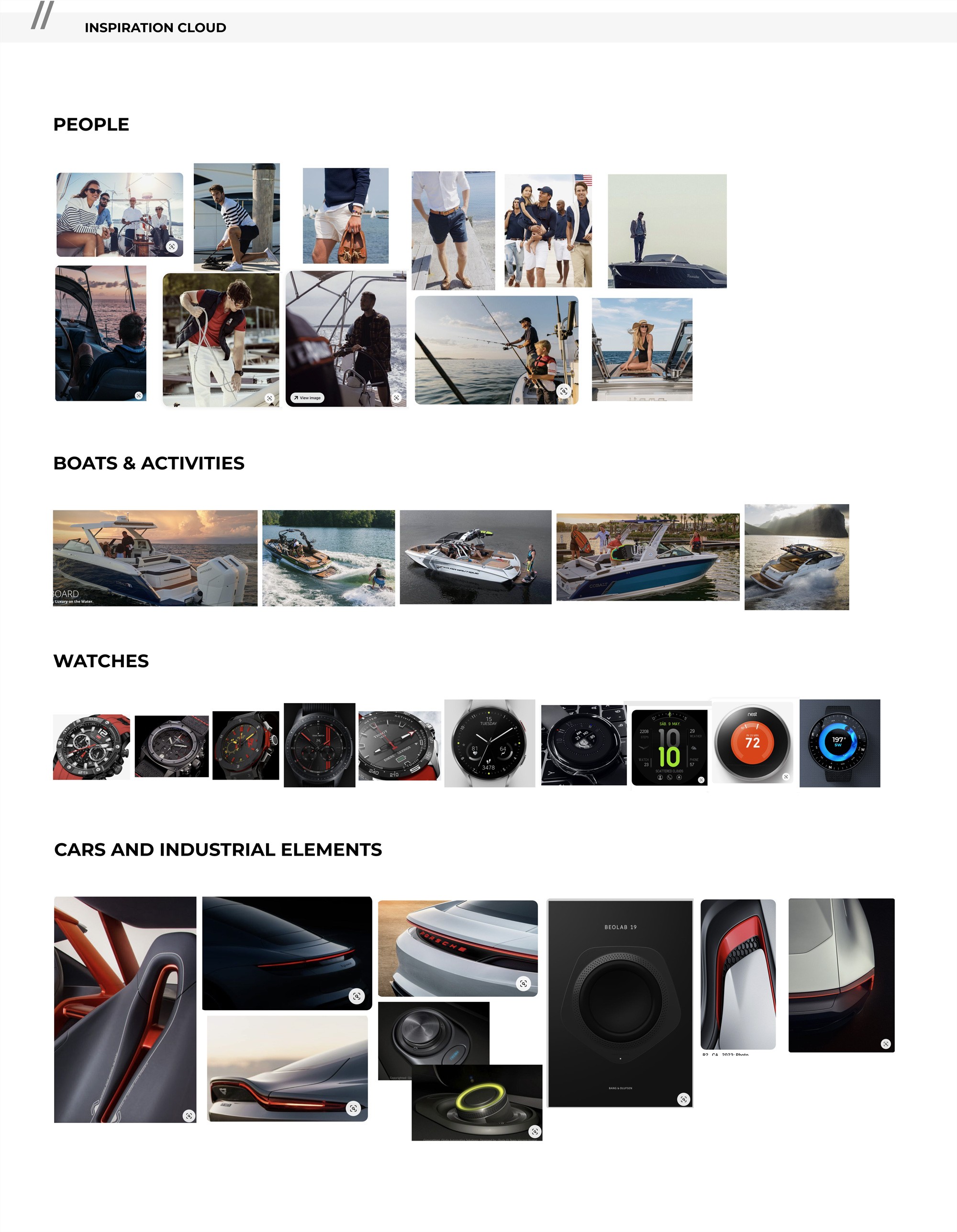
This is an essential exercise to complete before starting any actual design work - defining the vision, understanding who we are designing for, and gathering visual inspiration. For example, if the Simrad UI were a car, what kind would it be? What kind of watch, person, or sport would represent the brand? These comparisons help build a clear and aligned visual and emotional direction for the product.
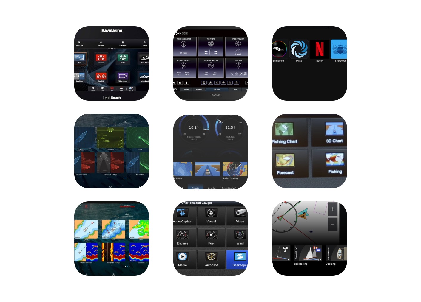
Competitors
These are examples of icons and pictograms used by our competitors:
Raymarine: Their UI stands out with a distinctive, polished look. As one of the first to transition to Android, they are ahead of the curve in terms of modern interface design.
Garmin: Their interface appears to lack consistency and a cohesive visual identity. Some icons resemble screenshots, while others belong to a mixed icon set, leading to a fragmented and less unified user experience.
Personas
Our primary audience is Jason, the serious sports fisherman aged 35–55 with a mid-to-high income. He owns a medium to large center console or battlewagon and spends his time fishing offshore and along the coast. As an early adopter of advanced tech like Halo radar and high-end sonar, Jason is always looking for ways to enhance his fishing experience.
Secondary audiences include weekend cruisers, social boaters, and empty nesters - generally all-rounders who use their boats for a mix of activities like fishing, cruising, wakeboarding, and exploring. While similar in age to Jason (except for the empty nesters), they tend to use their boats less frequently and typically only upgrade their equipment when necessary.


Exploration
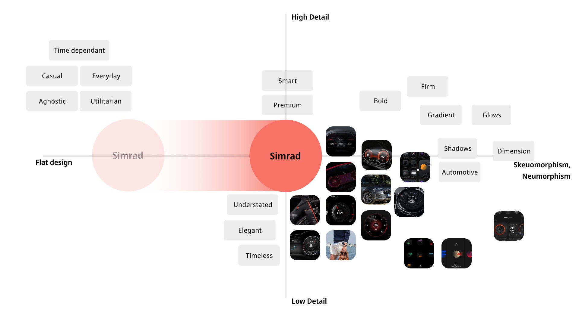
Here’s a glimpse into our key exploration milestones. During the design phase, we explored a wide range of styles and visual directions. It was essential to stay critical of our work and continuously align our decisions with the broader vision of the project.

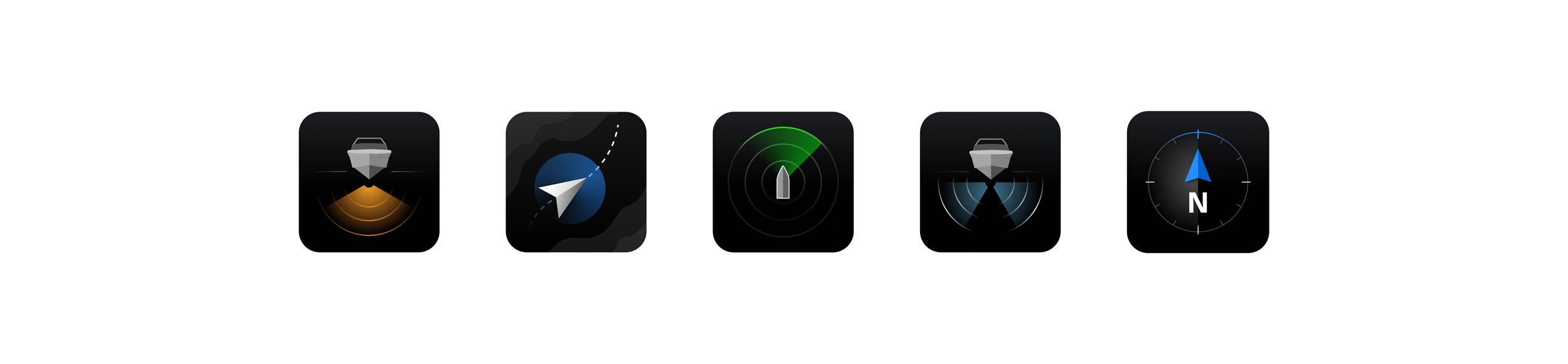
Concepts
At this stage, we selected a core set of icons to focus on - icons that would form the foundation for deeper exploration and iteration. The goal was to retain the essence of the original design while experimenting with variations to find the right balance between flatness and detail. Through this process, we discovered a visual “sweet spot” that felt light, elegant, and subtly mysterious - qualities that closely aligned with the brand’s identity. I concentrated on refining key nuances such as the shape of the boat, use of color accents, composition balance, and line weight, ensuring each icon communicated both clarity and character.

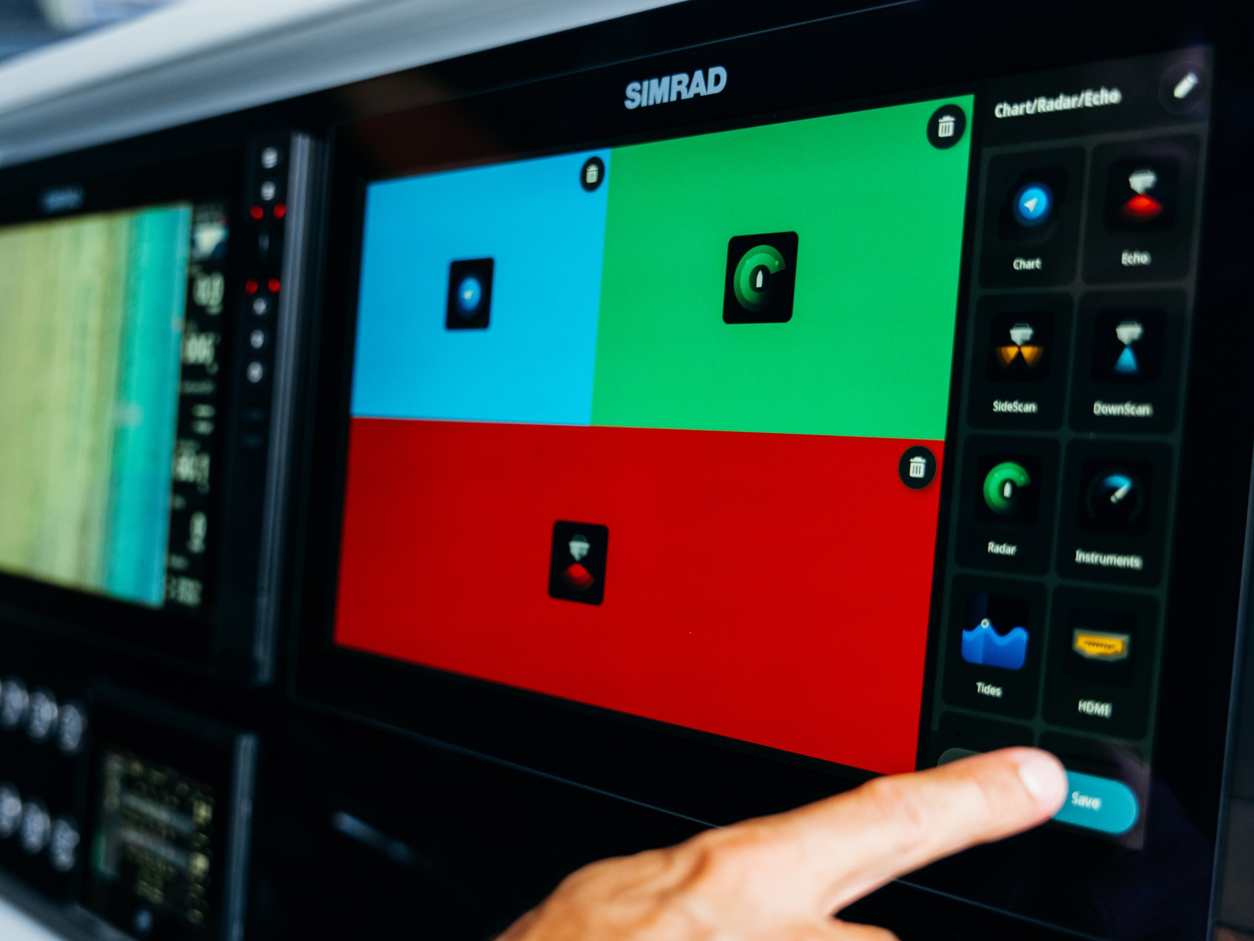
The most desirable
icons on the water
This icon redesign project marked a significant step in evolving Simrad’s digital identity. By creating a refined, scalable, and cohesive visual system, we helped shift the interface toward a more premium and user-friendly experience. The new iconography not only enhances usability across devices but also reinforces Simrad’s distinct brand presence in a crowded market - setting a strong foundation for future design consistency across products and platforms.
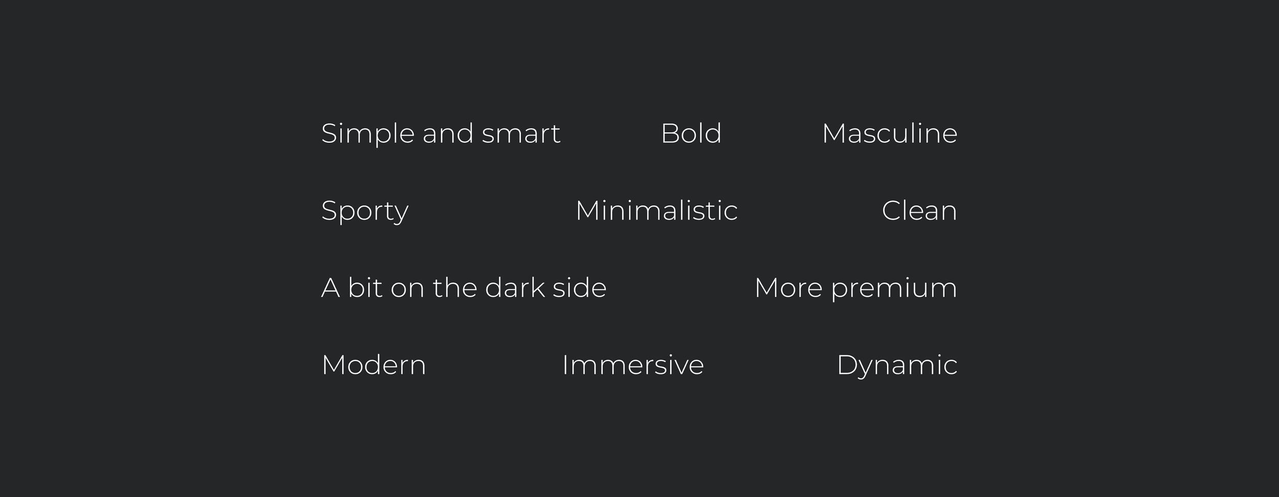
The visual direction is rooted in four core principles:
Timeless - a simple, enduring design adaptable to various environments;
Elevated - a harmonious balance of form and function;
Minimal - stripped of complexity to highlight essential elements;
Sophisticated - an elegant, high-craft aesthetic that aligns with Simrad’s premium brand positioning.

Next Project